


10th October 2018
5 Tips for Taking Great Photos of your Colouring
Part of the fun of creating, is sharing your masterpiece.
Whether you stick it to the fridge door or show your colleagues at break time, we all love to show off a little!
For many of us though, we share digitally on social media, so we rely on photos.
If you’ve spent hours, days even on a piece, you owe it to yourself to take a GREAT photo of it!
Read my 5 top tips for taking photos of your work and make sure you take photos that do your creations justice!
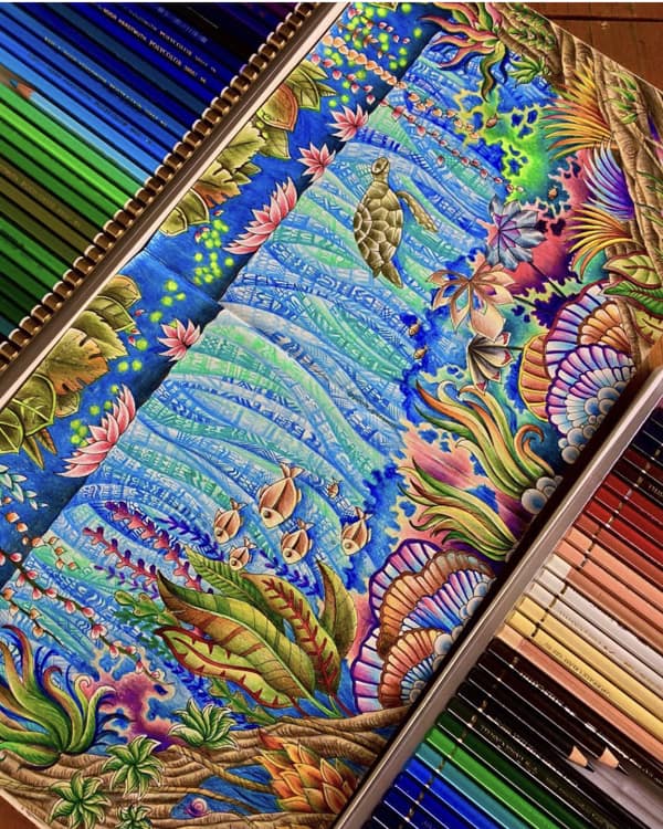
1. Yay for Flat Lay!
A bird’s eye view (or ‘flat lay’) is often the best composition for your photos. Put your colouring on a table or the floor, stand above it, look directly down and take the photo.
You don’t need to keep things square – this Lost Ocean flat lay (above) by @patrik_giacomelli is at a jaunty angle.
***
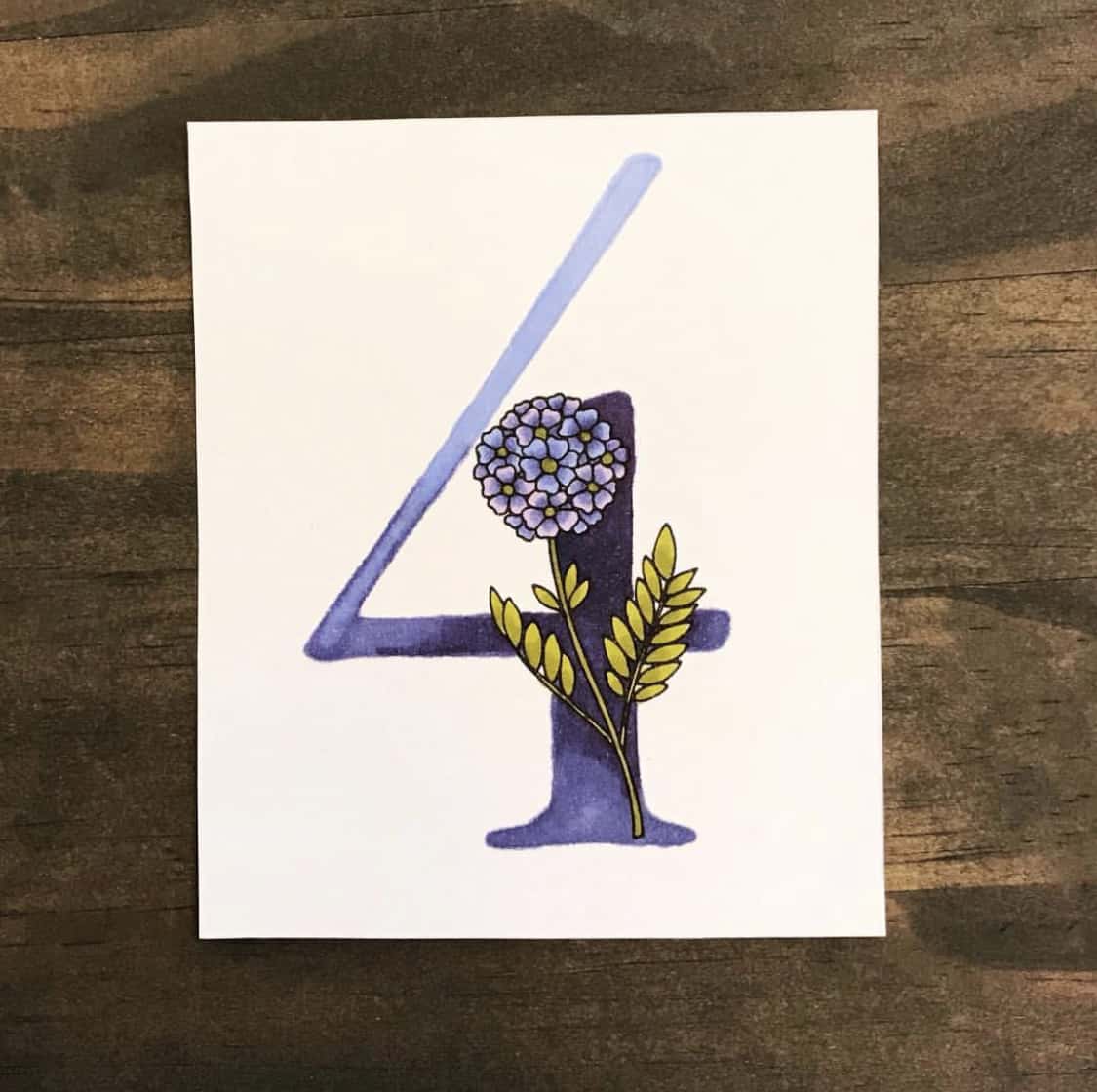
2. Background Check
If we’re going to see the background, make sure it’s either neutral enough to fade into the background (kitchen worktop, a wooden desk etc) or pretty enough to be part of the photo (pretty pebbles or a sandy beach?!). The background should compliment, not compete with your work of art.
A perfect background choice for @amberlovescoloring in her Day 4 of 30 Days of Flowers.
***
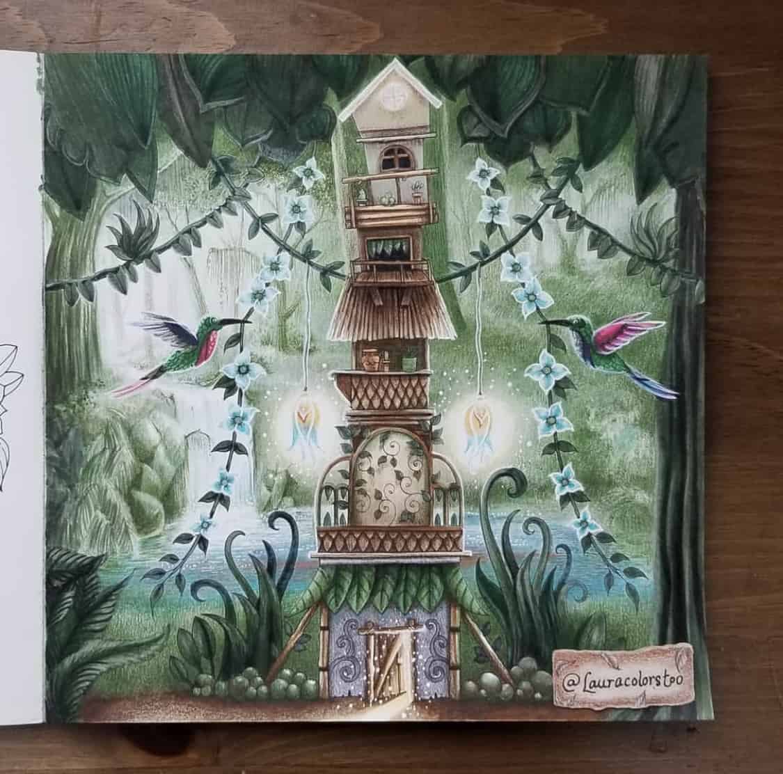
3. Daylight, Stay Bright!
Good lighting = pretty colours! They type of light you take your photo in will affect how the colours look. Try to avoid yellow, artificial light. The best light is daylight! Get near a sunny window or go outside. The daylight will best capture your true colours and will avoid that yucky yellow tinge that artificial light can create.
@Lauracolorstoo has a great lighting set-up in this Magical Jungle shot.
***
4. Top of the Crops!
Cropping is when we choose where the outer edges will be on a photo. So we can adjust what’s in the photo and what isn’t and also the overall shape. I usually prefer a square crop as it is the format most suited to social media, my colouring gallery and because by books are square! Use the square frame setting on your phone’s camera if you have one. For photos justof the artwork, try to crop outall 4 edges of the book by going closer. If you are creating a lifestyle image with props (see below for more on this!) still try to centre your image but stand a little further back to allow the background and these items to be seen.
@lilys_coloring has perfectly portioned her book to be in the centre of this photo, without showing the edges of the book.
***
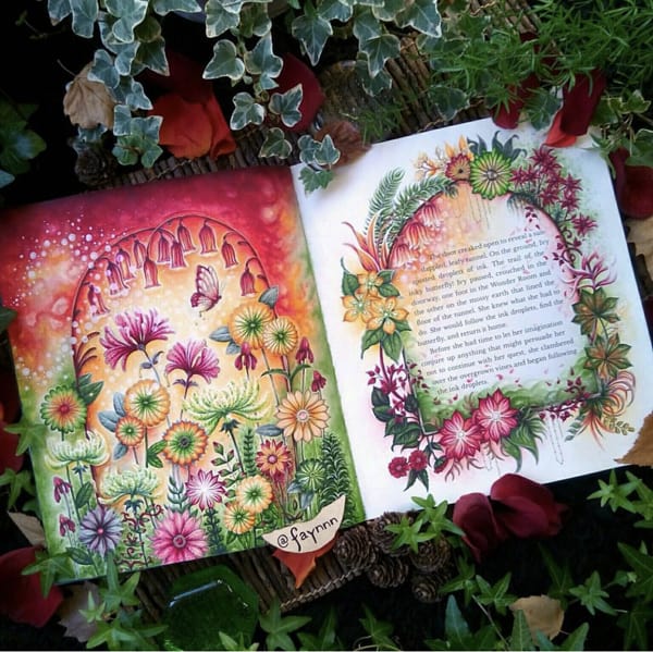
5. Prop like a Pro
Try adding a few props to your photos to make them like lifestyle shots. Things like pencils, pens, paintbrushes as well as more thematic choices like fresh flowers for Secret Garden or some shells for Lost Ocean all add a little extra charm and context to your photo. Just remember less is more – don’t clutter bomb!
Queen of the Props is @faynnn – every photo of her gorgeous colouring is a work of art. I ADORE!
***
Show me your Colours!
I hope that’s given you some ideas for how to take great photos of your coloring. I can’t wait to see them! Remember to upload your pictures to my Colouring Galleryor share them online and tag them with #johannabasford so I can find them! I love to see your masterpieces!
Before you go…
If you like this, then you should probably sign up for my weekly Inky Email newsletter. No junk or spam, just a weekly letter from me to you full of inspiration, studio sneak peeks and cool projects like this!
And don’t forget, my new book, World of Flowers is out in October! You can pre-order a copy today.

